If you thought that I was gonna stop updating this blog after the class I had to make it for ended, then you were absolutely wrong my friend. If I want to do art in any way that is even remotely professional it is important to applied what I learned. With time I hope to clean up and organize this website better not only so that it is easier to find but a more professional and enjoyable experience for everyone who visits. So now that my fun little introduction is over…
Let's talk about my art!
Now that all my finals are over with and Christmas break has started. I have finished all the art projects I needed to do for this semester! I had a buttload of digital art that I can share with you from that collaborative project I mentioned previously. In fact if I set it up right you should be able to see one of them as the featured image. If not I’ll fix it obviously but I think it would just be funny to keep this statement in here. Gotta have fun with this you know.
For everyone who is out of the loop, my final project in my digital arts class was to do a collaborative project with my classmates. What we did was we first took some pictures and make some quick images in photoshop, and then we put them into a group folder where we would take them and make unique pieces with all the pictures. I like how all of them turned out and I hope you do also.
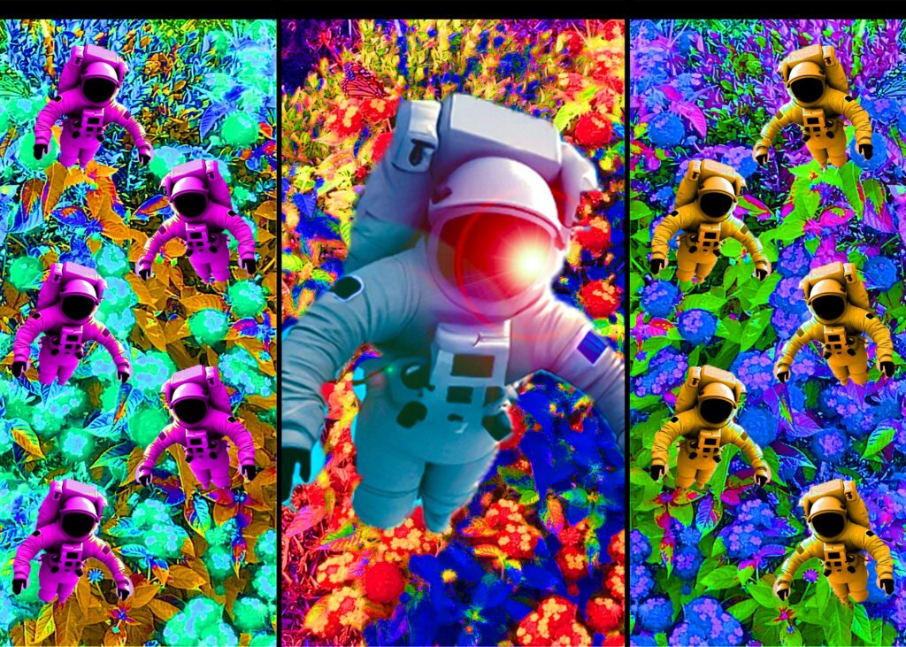
For this one I was particularly inspired by triptych style artworks. Which is basically just a trio of images with borders around them. One of the most famous being The Garden of Earthly Delights by Hieronymus Bosch. Even if you don’t know what I’m referring to you’ve probably seen it and I’d encourage you to look into his works! I also played with the lens flare effect with the glow on the astronaut’s helmet. Everyone who saw it during the critique said they liked it and that it reminded them of phone wallpapers.
You’ll notice that for a few of these there is definitely a pattern of playing with bright colors and repetition. I always loved repetition in artwork but it is much harder to do with painting than it is with digital art. I’m really glad I took this class though and I would love to explore it further alongside painting.
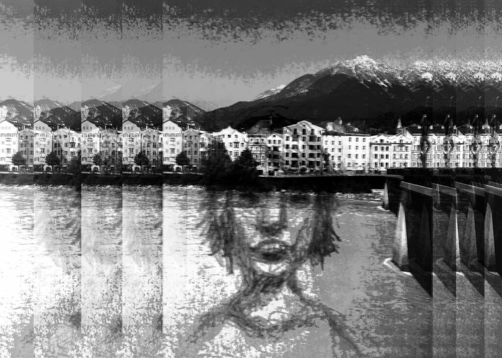
The drawing of the girl you see in this one is actually a scan of a sketch I did in my sketchbook back during the pandemic. I think it was actually one of the last things I drew before I got too burnt out from stress and had to take a break from… well, everything. Despite the sad memories attached to this sketch I do find the smile and look of it rather endearing, so I’m glad I can find someone about it to make me smile as well as have it live on in other artworks. Though I would suggest checking out my Instagram if you want to get a better look at the sketch itself without the background and edits. (Click the Instagram logo at the bottom of the page. Hint, hint.) I wanted to play with the idea you were looking at this through some sort of glass tile window. Even if a window isn’t the first thing that came to anyone mind when they see it I feel it definitely invokes the idea of a fractured reflection very well.
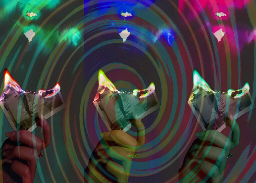
One of the students in my digital arts class actually took some pictures from a dance recital to submit for the other students to work on. I always liked seeing the dynamism and energy in the way people danced and as a result I loved applying it to my art. This is the second piece where I utilized the lens flare function in photoshop. Honestly lens flares are fun to draw and make and it definitely worked with this one, playing with the opacity of the images I was able to create this really ethereal atmosphere that combined with the background almost gives off the impression of a sort of stained glass window. This wasn’t intentional but it is definitely the impression everyone got and I enjoy how it turned out.
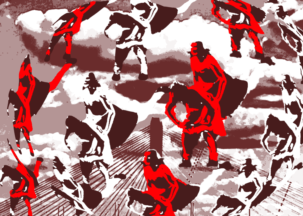
Of all the pieces I did these two are my favorites. For both of them I played with the filters and I decided to take a more graphic approach. I didn’t really have a specific goal or idea in mind with this one but I really like how it turned out. Something about the bright reds against the graphic looking background along with the more distorted images on the side really make it interesting. It kinda reminds me of this video game I played called Who’s Lila. I didn’t finish it but from what I have played its an amazing game and you should totally check it out. Here’s the trailer.
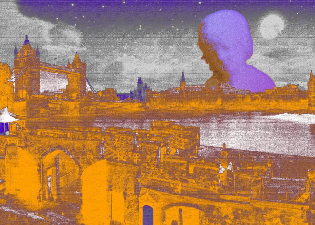
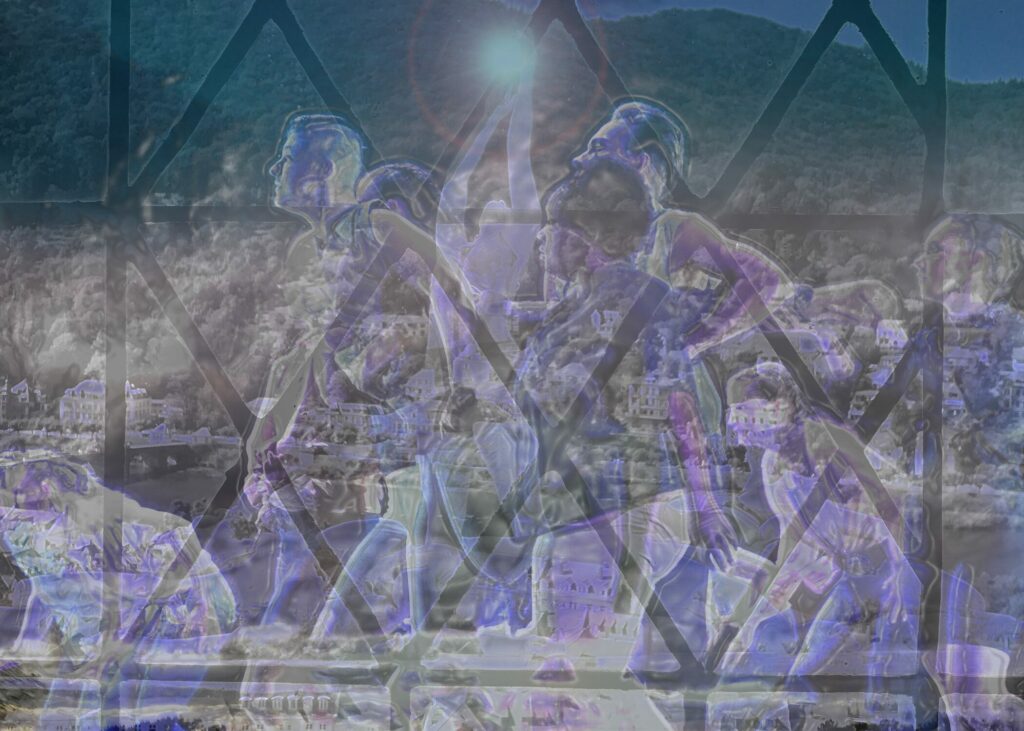
For this one the more graphic appearance of it was in part a pragmatic approach. The statue I used for the background was much blurrier than the city so playing with the filters and colors like this allowed them to look much more cohesive together. I love the complimentary colors and the way that it almost looks like it’s from an old book. A classmate told me it reminded them of Peter Pan. It is very dreamlike in its appearance and I like how I was able to make something so cohesive with photos of varying quality.
In Conclusion...
I am going to continue posting to this blog with the goal of refining not only my blogposts but my website as a whole. I had an enjoyable semester and I loved exploring a variety of different themes and aesthetics through my works, particularly in my digital art class. I hope you all enjoyed reading this post and I look forward to posting again soon!